The Silent Salesperson: How Pricing Architecture Decides Your Software Revenue Before Anyone Talks to You
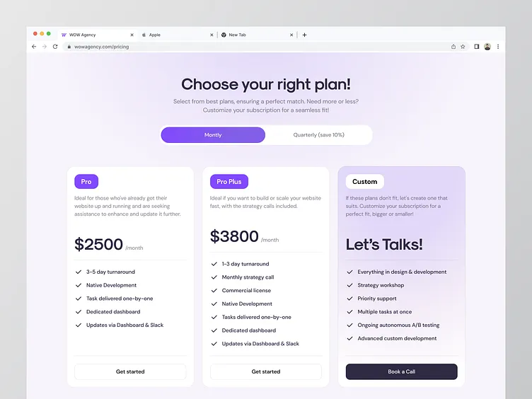
Photo: SaaS pricing page tiers on laptop screen modern office, via cdn.dribbble.com
Every pricing page is a conversation, whether the company behind it intended one or not. Long before a prospect clicks "Start free trial," the layout of that page has communicated who the product is for, how much the vendor believes in its own value, and — perhaps most tellingly — which customer the vendor wants most.
In the US software market, where buyers routinely evaluate five or more tools before committing, the pricing page has become the most consequential — and most neglected — conversion asset a software company owns.
The Anchor Is Never an Accident
Scroll through the pricing page of nearly any prominent American SaaS product and you will notice a familiar pattern: a premium tier sitting at the top, priced well beyond what most customers will ever pay. This is anchoring at work, a principle documented extensively in behavioral economics since the 1970s.
The premium plan serves a psychological function that has little to do with selling that plan. By displaying a $99-per-user enterprise option beside a $29 mid-tier offering, the vendor reframes the mid-tier as reasonable — even modest. The expensive tier is not really a product; it is a measuring stick.
What separates thoughtful vendors from careless ones is whether the anchor tier is genuinely aspirational or merely decorative. When the top plan includes features that mid-market buyers actually want — advanced permissions, priority support, audit logs — it creates upward pull. When it simply inflates seat counts, it reads as padding, and sophisticated buyers notice.
Decoys, Done Well and Done Badly
The decoy effect remains one of the most reliably exploited quirks in consumer decision-making. A middle tier deliberately engineered to look worse than the option beside it — same price, fewer features, or similar features, dramatically higher price — nudges the buyer toward the option the vendor prefers.
Done skillfully, decoy pricing respects the customer: it clarifies the value hierarchy and simplifies a genuinely complex decision. Done clumsily, it insults them. American buyers, particularly in B2B procurement, have grown fluent in these tactics. A decoy that is too obvious signals that the vendor sees pricing as manipulation rather than communication — and that impression bleeds into how the product itself is perceived.
What "Contact Sales" Actually Says
Perhaps no element of a pricing page carries more subtext than the button at the bottom of the enterprise tier. "Contact sales" communicates several things at once: the deal size justifies human involvement, the vendor expects negotiation, and the price is, in truth, whatever the market will bear.
For enterprise buyers, this is expected and even reassuring — it suggests a tailored relationship. But for a growing mid-market company, that same button can feel like a wall. It introduces a sales cycle into what could have been a self-serve purchase, and it hides the single piece of information buyers use to build internal budgets.
A growing number of US software companies have responded by publishing transparent enterprise pricing even when they retain a sales motion — a hybrid approach that filters serious buyers while preserving the option to negotiate.
Tier Names Are Branding, Not Labels
Consider the language of tier names. "Basic, Pro, Enterprise" is utilitarian and universally understood. "Starter, Growth, Scale" tells a story about the customer's trajectory — the buyer is not purchasing features but joining a journey. Neither approach is inherently superior, but the choice reveals how the vendor positions its relationship with customers: transactional or developmental.
The most effective tier names map directly onto the buyer's self-image. A two-person startup in Denver and a 4,000-person manufacturer in Ohio may need the same product, but they do not want to be addressed the same way.
The Underused Lever
Why does pricing design remain underappreciated? Partly because it sits awkwardly between departments. Product teams treat it as a commercial matter; marketing treats it as a detail; sales treats it as a constraint. No one owns it fully.
Yet the arithmetic is unforgiving. A pricing page that lifts conversion by even a few percentage points compounds across every visitor, every month, at zero incremental acquisition cost. Few product improvements can claim the same return on effort.
The vendors that treat pricing as a designed experience — tested, iterated, and written with the same care as a landing page — are not merely optimizing revenue. They are making a statement about how they think customers deserve to be treated. In a market as crowded as American software, that statement may be the most persuasive copy on the entire site.